

A country or multi-brand pavilion has to do more than look impressive from the aisle. The best pavilion design elements create a recognizable destination, give every participating brand room to perform, and make visitor movement feel natural rather than forced. When the pavilion is well planned, it turns a shared exhibition footprint into a business environment that supports meetings, product discovery, and qualified leads.
That balance is where many pavilion projects succeed or struggle. A bold façade may draw attention, but it cannot compensate for cramped exhibitor zones, unclear wayfinding, poor sightlines, or a layout that creates congestion at peak times. The strongest pavilions are designed as complete visitor experiences – with brand impact, operational practicality, and construction realities considered together from the first concept.
Best Pavilion Design Elements That Drive Results
A clear pavilion identity from a distance
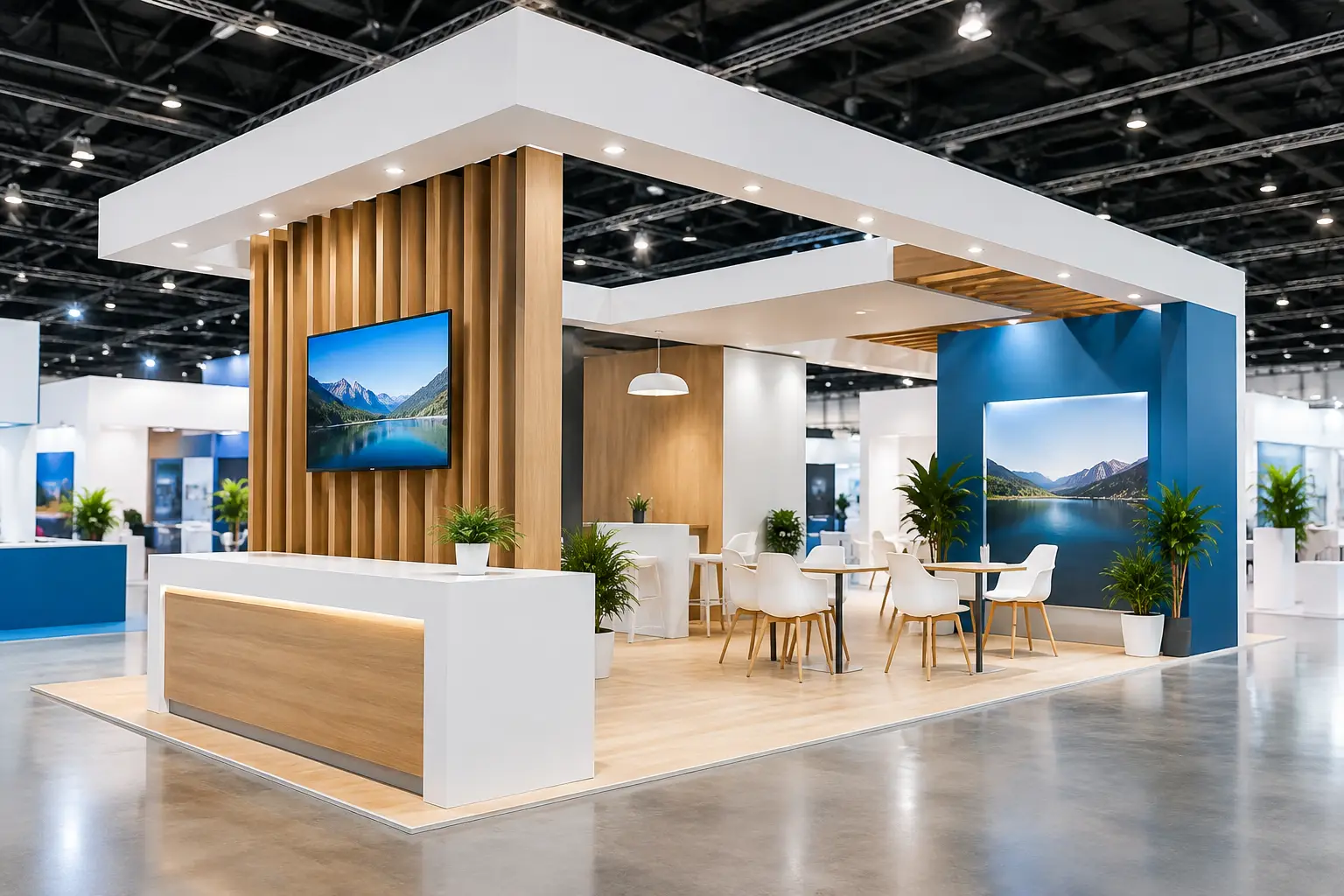
A pavilion should be identifiable before a visitor reaches it. This starts with a strong architectural language: a defined color palette, distinctive overhead features, coordinated graphics, and a consistent visual system across every participating exhibitor.
For a national pavilion, the identity may express a country’s industries, culture, innovation agenda, or export strengths. For a corporate group pavilion, it may reinforce the parent brand while allowing individual divisions or partners to retain their own presence. The key is hierarchy. Visitors should immediately understand who is hosting the pavilion, what it represents, and why they should enter.
Height, illuminated signage, hanging structures, and large-format LED displays can create valuable visibility on a busy show floor. However, scale must suit venue regulations, sightlines, and budget. A well-composed structure at the right height often performs better than an oversized feature that consumes funds needed for meeting areas, demonstrations, or quality finishes.
An open entrance with a reason to step inside
A pavilion can look premium yet feel closed if its boundaries are too heavy. Large walls at the perimeter may provide graphic space, but they can also block views into the activity that makes the stand compelling. Open corners, wide entry points, and transparent elements encourage visitors to cross the threshold.
The entrance should also answer a simple question: what is happening here? A working product demo, a visible hospitality lounge, an LED presentation, or a central feature installation gives people a reason to pause. This is particularly important for country pavilions where visitors may not know which companies are participating until they enter.
Open layouts do require discipline. If every exhibitor pushes for maximum frontage, the result can become visually noisy and difficult to navigate. A central planning approach protects the pavilion’s overall impact while giving each participant a fair and functional presence.
Intelligent zoning for exhibitors and visitors
Successful pavilion design depends on zoning. Each area should have a defined job, whether it is attracting footfall, presenting products, hosting scheduled meetings, offering hospitality, or supporting staff operations.
A practical pavilion often includes a central circulation route, outward-facing exhibitor displays, quieter meeting spaces, shared hospitality, and concealed storage or service zones. Product categories, company size, and lead-generation priorities should influence where brands are positioned. A company with live machinery or high-volume demonstrations may need a more open, accessible location, while a consultancy or government agency may benefit from a calmer meeting-led zone.
Visitor flow deserves close attention. Narrow aisles, dead ends, and meeting tables placed in primary traffic routes reduce dwell time and create frustration. At busy exhibitions such as GITEX, ADIPEC, The Big 5, or Gulfood, an extra few feet of circulation space can make the difference between a pavilion that feels energetic and one that feels overcrowded.
Consistent exhibitor modules without a cookie-cutter look
Pavilions often need to accommodate multiple companies with different products, budgets, and branding requirements. Modular exhibitor zones create control over space allocation, fabrication, electrical planning, and installation. They also help maintain visual consistency across the pavilion.
Consistency should not mean every booth looks identical. The most effective approach establishes a common architectural framework – aligned signage positions, compatible materials, shared lighting standards, and coordinated flooring – while giving each exhibitor room for its own graphics, product display, and sales message.
This flexibility matters when participant needs vary. A technology company may require screens and interactive stations, while a manufacturer may need shelving, sample displays, or a product plinth. Planning these differences early avoids last-minute additions that disrupt the pavilion’s look or create logistical issues during installation.
Lighting that guides attention and supports conversations
Lighting is one of the most overlooked pavilion design elements. Even high-quality graphics and finishes can appear flat under poor lighting. A layered plan works best: ambient lighting for overall comfort, accent lighting for products and graphics, and focused task lighting for meeting or demonstration areas.
Illuminated branding can increase visibility, especially in halls with dense competition. LED video walls add movement and allow messaging to change throughout the event, but they need a clear content strategy. A screen filled with small text, repetitive corporate videos, or overly fast visuals will not hold attention from the aisle.
Consider the atmosphere each area needs. Product zones can be brighter and more energetic. Meeting spaces should feel professional and comfortable, with lighting that supports face-to-face discussion. The goal is to guide attention without turning the pavilion into visual overload.
Functional Details That Protect the Visitor Experience
Meeting areas that feel private, not isolated
For many exhibitors, the most valuable pavilion outcome is a qualified conversation. Meeting areas should be easy to reach while offering enough separation for serious discussions. Semi-private lounges, glazed meeting rooms, and screened seating areas are often more effective than placing tables in the middle of an open aisle.
The right choice depends on the sales cycle and the subject matter. High-value B2B deals, technical consultations, and government meetings may require enclosed rooms. For shorter conversations and lead qualification, open but well-designed seating can keep the pavilion more welcoming.
Do not underestimate storage. Hidden storage for brochures, refreshments, staff belongings, cleaning supplies, and product replenishment keeps public spaces professional throughout the show. It also gives the operating team a practical place to work without compromising the visitor-facing environment.
Technology that serves a commercial purpose
Interactive displays, touchscreens, video walls, virtual product tours, and lead capture systems can add real value when they support a defined visitor journey. Technology should explain a complex product, visualize a large-scale solution, collect useful data, or help staff begin better conversations.
Adding technology simply because it appears modern can have the opposite effect. Complex installations need reliable power, testing, content management, and on-site support. If a digital experience cannot be maintained throughout the show, a simpler physical display may create a more dependable result.
For international exhibitors, it is also worth considering language options, accessibility, and the speed at which visitors can understand the interface. The best digital touchpoint does not demand a long learning curve. It makes the next conversation easier.
Materials built for quality, safety, and reuse
Pavilion materials must look premium, withstand continuous footfall, and comply with venue safety requirements. Durable flooring, clean edge detailing, reliable fixtures, and well-finished joinery all influence how visitors perceive the brands represented within the space.
Sustainable choices can be commercially sensible as well as responsible. Reusable structural components, recyclable graphics, rental furniture, energy-efficient lighting, and materials that can be repurposed after the event can reduce waste without reducing visual impact. The practical trade-off is that reuse works best when it is planned from the beginning, not added after a design has been finalized.
A dependable design-and-build partner should also account for venue rules, fire safety documentation, rigging approvals, electrical loads, logistics schedules, and installation access. These are not separate from design quality. They are what allow a strong concept to be delivered accurately and on time.
Designing the Pavilion Around Measurable Goals
Before approving a concept, define what success looks like. Is the priority exporting leads for participating companies, hosting investor meetings, demonstrating national capabilities, launching products, or increasing brand recognition? The answer should shape the layout, staffing plan, technology choices, and space allocation.
For example, a pavilion focused on lead generation needs visible exhibitor identity, quick conversation areas, and an efficient capture process. A pavilion built around formal delegations needs a stronger hospitality program, private meeting capacity, and controlled access. Neither approach is universally better. The best pavilion design is the one that supports the actual commercial objective.
At LemonTree Exhibitions, pavilion projects are approached as integrated environments rather than a collection of separate booths. That means aligning the visual concept with fabrication, logistics, on-site installation, exhibitor requirements, and the realities of the exhibition venue from the outset.
A pavilion earns attention through confident design, but it earns trust through the details visitors may never consciously notice: easy navigation, comfortable conversations, well-lit products, organized operations, and a finish that stays sharp from opening morning to dismantling. Start with the visitor journey and business goal, then let every design decision support both.