
A booth that looks impressive in a render but fails on the show floor is expensive theater. The real question behind how to design exhibition booth spaces is not just how they should look. It is how they should work – for foot traffic, conversations, product demos, lead capture, and the practical realities of build time, venue rules, and budget.
That is where many exhibition projects go off track. Teams focus on finishes before objectives, or they approve a concept without thinking through visitor flow, storage, staffing, or sightlines. Strong booth design is a commercial decision as much as a creative one. When it is done properly, the space pulls people in, supports your team, and gives your brand a presence that feels credible from every angle.
Start with the job the booth needs to do
Before colors, graphics, or structures, define the booth’s role in your event strategy. A booth for launching a product at a major technology show will need a different layout from one built for relationship meetings at an industry exhibition. The same is true if you are exhibiting to distributors, procurement teams, government delegates, or end users.
The most useful starting questions are simple. Do you need high visitor volume or better-qualified conversations? Are you demonstrating products, hosting private meetings, collecting leads, or building awareness in a crowded hall? Is the booth meant to support a premium brand position, or does it need to work harder within a tighter footprint and budget?
Those answers shape everything that follows. If your team needs privacy for commercial discussions, open-plan design alone will not solve the problem. If live demos are central to your sales process, screen placement, power access, sound control, and viewing distance become design priorities, not technical afterthoughts.
How to design exhibition booth layouts around visitor behavior
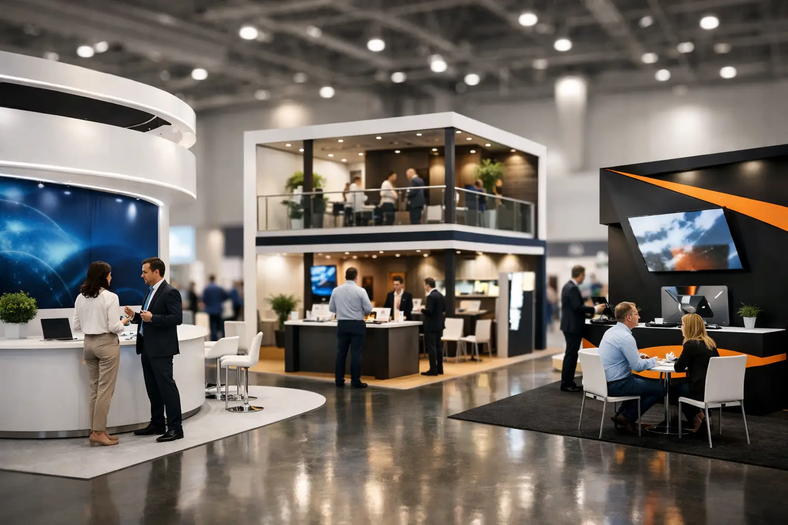
Visitors do not experience your booth the way your internal team does. They see it in motion, often from a distance, while processing dozens of competing messages around them. Good layouts respect that reality.
The first rule is clarity. From the aisle, people should understand who you are and what you offer within a few seconds. That means your main brand message needs to be visible at height, cleanly presented, and not buried under too much text. If your booth asks visitors to work too hard to understand it, they will keep walking.
The second rule is access. A booth should feel easy to enter, not blocked by counters, furniture, or decorative elements. Many brands make the front edge too heavy, which creates a visual and physical barrier. An inviting entry point, supported by strong side visibility, usually performs better than a design that tries to control every movement.
The third rule is zoning. High-performing booths typically separate public and private activity without making the space feel fragmented. Product displays and engagement points belong where traffic is strongest. Meeting tables should sit deeper inside the stand or behind partial architectural screening. Storage must be planned early. Without it, bags, brochures, giveaways, and staff items end up in plain view, which quickly weakens the premium feel of the space.
For larger booths, circulation becomes even more important. A double-decker or pavilion stand may look bold, but it also needs intuitive pathways, safe access, and balanced use of upper and lower levels. Bigger structures create more opportunity, but they also create more ways to lose control if the layout is not disciplined.
Design for brand recall, not decoration
A common mistake in exhibition design is confusing visual complexity with impact. More materials, more shapes, and more graphic layers do not automatically create a stronger presence. Often the opposite is true.
The best booth designs build around a few clear brand cues. That could be a distinctive architectural shape, a memorable material finish, a strong lighting concept, or a focused message integrated across screens, graphics, and product display. The goal is not to say everything. The goal is to make your brand recognizable, credible, and easy to remember after the event.
This is especially important for companies exhibiting in sectors like manufacturing, pharma, energy, or B2B technology, where decision-making is serious and trust matters. In those environments, design should feel intentional and well-built. Visitors notice finishing quality, structural confidence, screen integration, edge details, and how neatly the booth is maintained during the show. Premium does not always mean flashy. Often it means controlled, polished, and appropriate to the audience.
Materials, lighting, and screens should support the sales experience
Once the layout is working, the design details need to reinforce it. Materials should match your brand position and event context. Gloss finishes and dramatic lighting may suit a consumer-facing launch, while matte surfaces, engineered textures, and integrated lighting often work better for a more technical or corporate audience.
Lighting deserves more attention than it usually gets. Poor lighting can flatten graphics, make product displays look underwhelming, and create unflattering meeting areas. Good lighting does three jobs at once – it attracts attention from the aisle, highlights key features within the booth, and creates comfort for visitors staying longer.
Screens and LED walls are equally powerful when used with restraint. They can stop traffic, explain complex products, and add movement to the booth. But oversized content, poor brightness control, or generic looping videos can turn a useful asset into visual noise. Content needs to be built for exhibition viewing, with concise messaging, strong visuals, and motion that reads well at a distance.
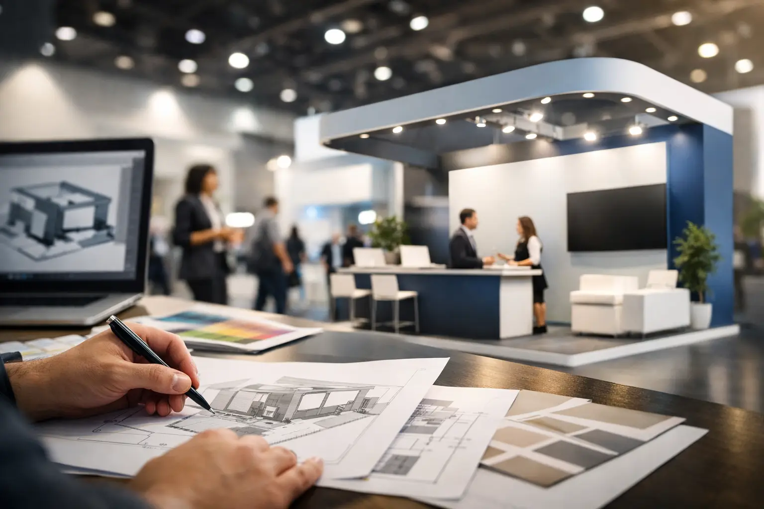
Budget decisions should happen early, not after design approval
If you want to know how to design exhibition booth concepts without costly redesigns, start by being realistic about budget from day one. This does not limit creativity. It improves it.
A good design partner will align concept ambition with practical cost drivers such as booth size, structure type, material choices, custom fabrication, AV requirements, logistics, venue regulations, and installation timelines. If these factors are ignored early, the first concept may look strong but collapse during value engineering.
There are always trade-offs. A fully custom stand creates stronger differentiation, but modular components may deliver better value if you exhibit often across multiple cities. A double-decker structure can expand meeting capacity and visibility, but only if the event audience and budget justify it. Large LED features create impact, but not every booth needs them to perform.
The right question is not, “What is the cheapest booth we can build?” It is, “Where should we invest to get the strongest return?” Sometimes that means spending more on height and lighting while simplifying finishes. Sometimes it means prioritizing hospitality and meeting space because sales conversations matter more than broad traffic.
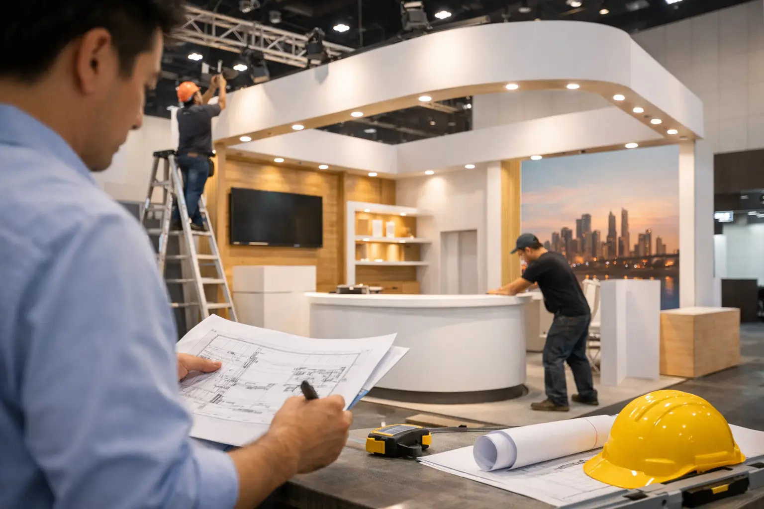
Buildability matters as much as creativity
A booth design only works if it can be fabricated accurately, installed on time, and handed over without last-minute compromise. This is why operational discipline matters so much in exhibition projects.
Designs need to account for venue restrictions, rigging limits, electrical planning, floor loading, material approvals, storage, dismantling schedules, and transport realities. These details are not secondary. They affect what is possible, how long it takes, and how cleanly the finished booth matches the approved concept.
This is also where working with an experienced exhibition stand partner makes a measurable difference. Teams that handle design, fabrication, logistics, and site execution under one roof usually have tighter control over quality, timing, and accountability. At LemonTree Exhibitions, that end-to-end approach is central because attractive concepts are only valuable when they arrive on the show floor exactly as promised.
Test the design against show-day reality
Before sign-off, pressure-test the booth as if the event were happening tomorrow. Where do staff keep personal items? Where are leads captured? Can five people watch a demo comfortably? Will the sales team be speaking over surrounding noise? Is there enough branding visible from all open sides? Can the booth still look organized after six hours of heavy traffic?
This stage often reveals the small decisions that protect performance. A hidden storage room, a better-positioned reception counter, cleaner cable management, stronger overhead branding, or more practical furniture can make a major difference once the exhibition opens.
It is also worth considering sustainability at this point. Reusable structures, recyclable materials, and components designed for future events can reduce waste and improve long-term value. Sustainable thinking works best when built into the design from the start, not added later as a marketing line.
The strongest booth is not always the one with the biggest structure or the loudest visuals. It is the one that knows exactly what it is there to achieve and is designed accordingly. If your booth can attract the right audience, support your team, reflect your brand properly, and stand up to the realities of live execution, it is doing what it should. That is the standard worth designing for.