
The difference between a busy booth and an ignored one is rarely the event itself. More often, it comes down to how the space is arranged. If you are figuring out how to arrange exhibition stall areas for stronger footfall, better conversations, and cleaner brand presentation, the right answer is not simply to add more graphics or furniture. It is to make every square foot work with purpose.
At trade shows, visitors make decisions fast. They scan from the aisle, judge relevance in seconds, and move on just as quickly. A well-arranged stall helps them understand who you are, what you offer, and where to go next without friction. That is what turns design into performance.
Start with the goal before the layout
Before choosing counters, screens, shelving, or product zones, decide what the stall needs to achieve. A product launch booth is arranged differently from a lead-generation booth. A hospitality-led stand for existing clients needs a different flow than a high-volume demo space built for new prospects.
This is where many exhibition teams lose momentum. They begin with a visual reference instead of a business objective. The result may look polished, but it often underperforms because the arrangement does not support the real use of the space.
If your primary goal is lead capture, the layout should make it easy for visitors to enter, engage, and speak with staff. If your goal is product display, the arrangement should prioritize visibility and interaction. If your goal is brand positioning, the structure, messaging, and visitor journey need to feel premium from the first glance.
How to arrange exhibition stall space for visitor flow
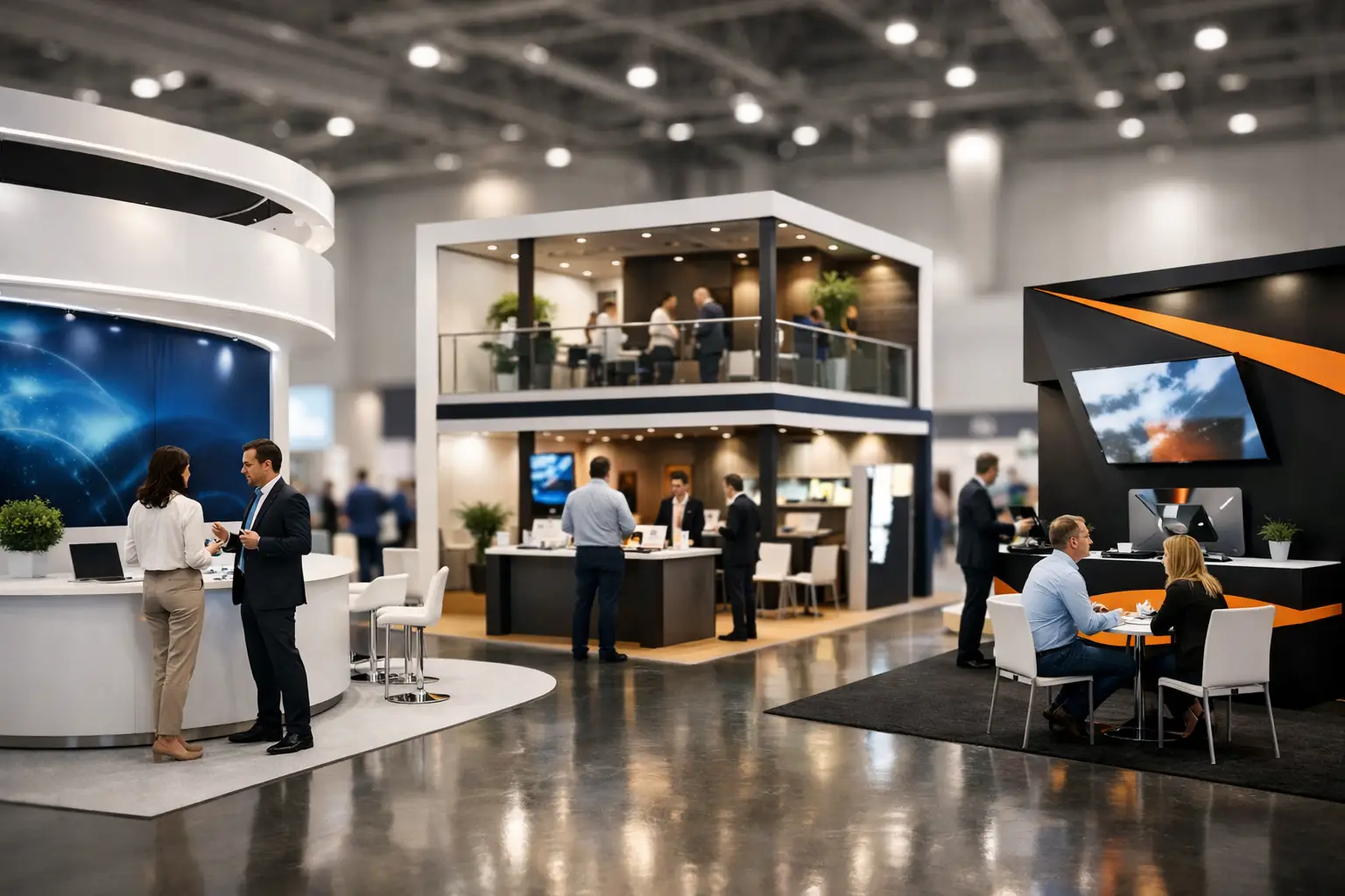
Visitor flow is the backbone of stall planning. If people cannot enter comfortably, pause without blocking others, or move naturally toward key touchpoints, even an expensive stand can feel crowded or confusing.
The front of the stall should feel open and inviting. A common mistake is placing reception desks, product pedestals, or furniture too close to the aisle. That creates a visual and physical barrier. In most cases, your entrance should allow visitors to step in without feeling they are interrupting a private meeting.
Once inside, the path should be obvious. Visitors should immediately see where the main product, screen, demo, or conversation point is located. If there are multiple zones, they should connect logically rather than compete for attention.
For smaller booths, simplicity usually performs better. One strong message, one focal display, and one clean meeting point can outperform a packed arrangement with too many competing elements. For larger stands, zoning matters more. You may need separate areas for live demos, product showcases, casual discussions, and private meetings. The key is to keep those zones connected while avoiding dead corners.
Put your strongest message at eye level
Exhibitions are crowded environments. You are not competing only with nearby exhibitors. You are competing with noise, fatigue, and limited visitor attention.
That is why the most important message should never be buried in dense text or placed too low. Your brand name, offer, and category should be readable from a distance. If someone walks past your stall and cannot tell what you do in three seconds, the arrangement is not doing its job.
Think in layers. High-level branding attracts attention from afar. Mid-level messaging explains value as visitors approach. Product or service details support the conversation once they are inside. This progression keeps the stall easy to read and prevents visual overload.
Screens, LED walls, and lightboxes can be highly effective, but only when they support the message rather than dominate it. Movement draws the eye, but too much motion can distract from the actual reason to stop.
Arrange products by relevance, not by quantity
Many brands try to display everything. That instinct is understandable, especially when exhibition space is expensive. But too much product in one stall often weakens impact instead of increasing it.
A better approach is to display what matters most to the audience at that event. Lead with hero products, high-margin solutions, innovations, or categories most relevant to the show. Arrange supporting items around that story.
For example, if you are exhibiting at an industry event where buyers are focused on one product line, that line should take center stage. Secondary offerings can be introduced through graphics, digital content, brochures, or conversation points. Physical space should be reserved for what is most likely to start meaningful discussions.
This is especially important for manufacturing, pharma, technology, and FMCG exhibitors, where product depth can be substantial. Curation almost always creates a stronger visitor experience than volume.
Build around conversations, not just displays
A good exhibition stall is not a showroom alone. It is a working sales environment. That means the arrangement must support real interactions between your team and your audience.
If staff members have nowhere comfortable to stand, greet, or speak with visitors, engagement suffers. If meetings happen in the middle of heavy traffic, discussions feel rushed. If seating areas are too hidden, visitors may not realize they are welcome.
The right conversation setup depends on the type of event and the profile of your visitors. High-traffic events may need standing discussion points and quick demo counters. Longer-cycle B2B sales often benefit from semi-private tables or enclosed meeting rooms. There is no one arrangement that fits every brand.
What matters is matching the environment to the expected interaction. At major exhibitions such as GITEX, ADIPEC, or Gulfood, where brands often balance visibility with serious business meetings, the most effective stands usually combine open engagement at the front with more focused discussion areas behind.
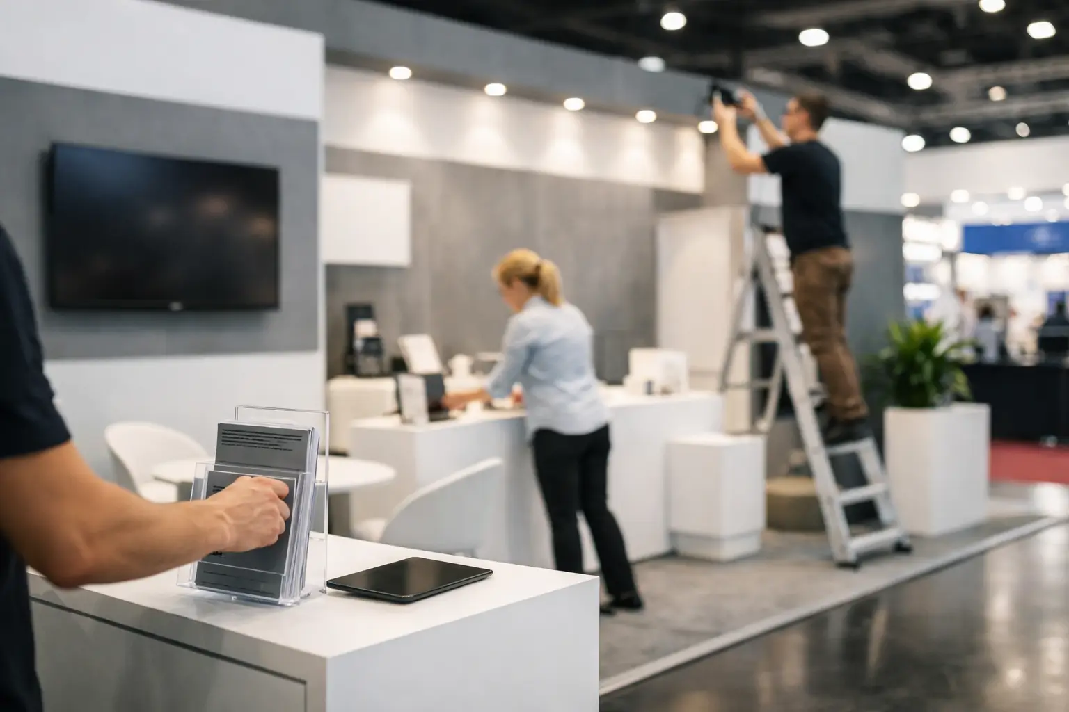
Lighting, storage, and staffing should shape the plan
These details are often treated as secondary. They should not be.
Lighting affects what visitors notice first. It can elevate products, improve the perceived quality of finishes, and create depth in the space. A stall with average materials but smart lighting can feel more premium than a costly build with flat illumination.
Storage is just as important. If staff bags, boxes, brochures, giveaways, and refreshments are visible from the aisle, the stand loses discipline fast. A clean stall depends on hidden operational space. That may be a back room, under-counter storage, or integrated cabinetry, but it needs to be planned early.
Staffing also influences arrangement. A booth for three team members is arranged differently from one hosting twelve. You need enough open space for movement, clear ownership of zones, and practical placement of lead capture tools. Booth design should make staff performance easier, not harder.
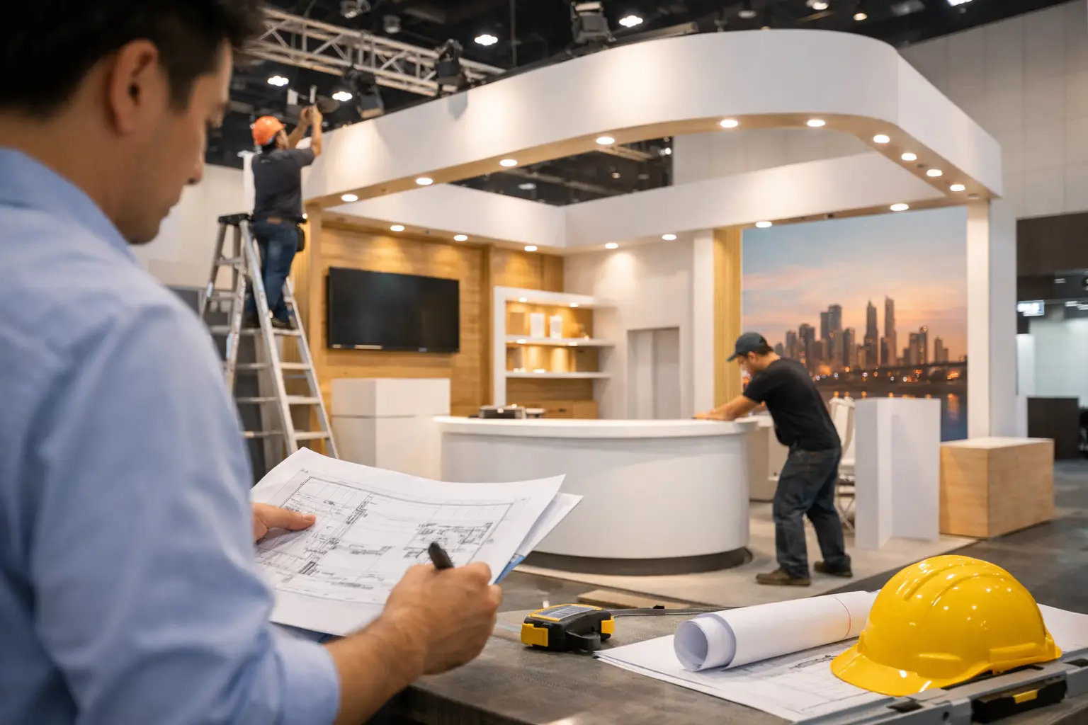
Budget and booth size change the answer
When clients ask how to arrange exhibition stall layouts, the honest answer is that it depends on booth size, event rules, product type, and budget. A 9 sqm booth cannot be treated like a 100 sqm custom stand. A cost-effective shell scheme requires different choices than a fully bespoke environment.
That does not mean smaller stands cannot be bold. It means they need sharper prioritization. Focus on one clear message, one standout visual, and one easy entry point. Avoid oversized furniture and unnecessary partitions.
Larger booths offer more flexibility, but they also introduce more risk. Without discipline, extra space can become empty, repetitive, or difficult to manage. The best large stands use scale strategically. They create presence from afar and clarity up close.
Experienced exhibitors usually treat budget as an allocation exercise, not a limit alone. Spending more on structure while ignoring layout, messaging, or staffing rarely works. Strong outcomes come from balancing design ambition with practical execution.
Test the arrangement from the aisle
One of the simplest ways to improve a stall plan is to review it from a visitor’s perspective. Stand at the imaginary aisle and ask a few direct questions. Can someone tell what the brand offers? Is the entrance open? Is the main attraction visible? Is there a reason to step in? Is there enough room to stay?
If the answer to any of those is unclear, the arrangement needs refinement.
This is where a detail-oriented exhibition partner adds real value. It is not only about producing the stand on time. It is about understanding how branding, fabrication, traffic flow, technology, and on-site realities come together. Companies such as LemonTree Exhibitions often approach this process end-to-end because the arrangement only works when design intent and build execution stay aligned.
Good arrangement makes selling easier
The best exhibition stalls do not force visitors to figure things out. They guide attention, support conversation, and reflect the brand with confidence. That is the real objective when deciding how to arrange exhibition stall space.
A smart arrangement makes your team more effective, your message easier to absorb, and your investment more measurable. When the space is planned around real visitor behavior, the booth stops being a backdrop and starts working like a business tool.
Before your next event, resist the urge to simply fill the floor plan. Arrange it so the right people know where to look, where to walk, and where to start the conversation.