

A crowded aisle is not proof that a booth is working. If visitors cannot understand what you offer, find the right product, or speak with the right person, foot traffic becomes wasted opportunity. The best exhibition booth layouts turn a fixed floor space into a clear visitor journey – one that attracts attention, supports conversations, and gives your sales team room to perform.
For marketing managers and exhibition procurement teams, layout is one of the earliest decisions with the biggest downstream effect. It influences stand design, construction cost, staffing, lead capture, product display, AV placement, and even the pace of installation. A striking façade matters, but the plan behind it determines whether the stand can deliver measurable business value.
Start With the Outcome, Not the Footprint
A 30-by-30-foot space can support a product launch, a hospitality-led experience, private buyer meetings, or high-volume lead collection. It cannot do all of them equally well. Before choosing a layout, establish the primary job of the booth.
If the goal is rapid lead generation, the layout should favor open entry points, quick demonstrations, and visible messaging from multiple approaches. If the objective is relationship-building with distributors or enterprise buyers, protected meeting areas and a more controlled hospitality zone may be worth more than a large product display. For a technical product, visitors often need a guided sequence: attract, explain, demonstrate, discuss, and capture the next step.
This decision keeps the project focused. It also helps prevent a common problem: adding a lounge, storage room, demo area, bar, and meeting room to a modest space until none of them work properly.
Best Exhibition Booth Layouts for Common Goals
The right format depends on your location on the show floor, the number of open sides, the size of your team, and how visitors are expected to engage. These are the layouts that consistently perform across B2B exhibitions.
The Open Island Layout for Maximum Visibility
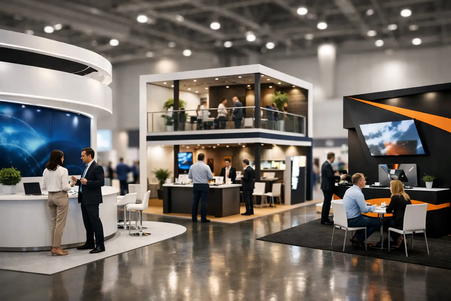
An island booth is open on all four sides. It is often the strongest option for brands that need broad visibility, multiple entry points, and a prominent presence at major trade shows. The central area can hold a large product, interactive demonstration, or LED video wall, while the outer edges invite visitors in.
The trade-off is discipline. With no natural back wall, an island booth can become visually noisy or expose clutter from every angle. Storage, staff access, cabling, and meeting spaces must be integrated carefully. A central feature should be high-impact without blocking sightlines across the stand.
This format is particularly effective for automotive, energy, machinery, technology, and large-scale product brands. It also creates a strong foundation for a double-decker structure when the show regulations and budget support it.
The Corner Layout for Strong Value From a Smaller Space
A corner booth has two open sides, giving a brand more visibility than a standard inline space without the cost of an island stand. It works well when one side draws heavier aisle traffic and the second side can support product discovery or a secondary message.
Place the boldest brand statement toward the main traffic route, then use the second open side to create an easy entrance. Avoid placing tall counters or enclosed rooms at the corner itself. That prime visual real estate should remain open and welcoming.
For SMEs and exporters, a corner layout can feel premium when the design has one clear focal point, disciplined graphics, and enough open floor area for staff to engage visitors. It is often a smarter commercial choice than overbuilding a small inline booth.
The Guided Journey Layout for Complex Products
Some products need context before they make sense. Pharma equipment, industrial systems, enterprise software, and specialized manufacturing solutions often benefit from a guided journey layout. Visitors move through defined zones, usually beginning with a clear value proposition and continuing through applications, demonstrations, proof points, and consultation.
The route should feel natural, not forced. Use changes in flooring, lighting, display height, or graphic messaging to signal progression. Keep the entrance broad, and make sure visitors can leave easily at any point. A layout that feels like a maze will reduce dwell time rather than increase it.
This approach is especially useful when several product lines need to be presented under one brand story. It gives sales teams a repeatable conversation structure while allowing visitors to self-select the areas most relevant to them.
The Hospitality-First Layout for High-Value Meetings
At shows where the priority is distributor development, investor meetings, or senior-client engagement, a hospitality-first layout can outperform a product-heavy plan. The public-facing edge still needs a strong visual statement, but the center of the stand is organized around comfortable, semi-private discussion areas.
This does not mean closing the booth off. The most effective hospitality stands balance access and privacy. An open reception point can qualify visitors, while smaller meeting tables, a lounge, or enclosed meeting rooms support longer conversations. Storage and pantry functions should be discreet but close enough to keep service responsive.
For larger footprints, an upper level can provide a quieter meeting environment while the ground floor remains active and accessible. The investment makes sense when one meaningful conversation can justify the additional build cost.
Plan the Visitor Journey in Zones
Strong layouts give each square foot a job. Rather than treating the booth as one open room, organize it into a series of practical zones: attract, engage, demonstrate, meet, and support.
The attract zone sits on the aisle edge. It needs immediate clarity, not a wall of copy. A powerful product silhouette, concise message, kinetic element, or well-positioned LED screen can create the necessary pause. The engage zone is where staff begin conversations, often with a small interactive display or reception counter.
The demonstration zone needs enough clearance for a group to gather without blocking the entry. This is where many layouts fail. A demo that draws six people but occupies a narrow aisle creates congestion and makes the booth appear inaccessible. Build circulation around the demonstration, not through it.
Meeting areas should be placed away from the busiest edge, but not so far back that they feel hidden. Finally, support areas such as storage, pantry space, staff belongings, and technical equipment need to be planned from day one. When support functions are ignored, they reappear as visible clutter on opening day.
Design for Sightlines and Staff Movement
A visitor should understand your brand from 20 to 30 feet away, identify the main attraction as they approach, and see where to go next once they enter. That requires careful sightline planning from every open side.
Tall walls can create authority and provide valuable graphic area, but they can also cast shadows or block the very product they are meant to frame. Suspended branding and elevated signage improve long-range visibility where venue rules permit. LED walls can add energy, though screens should support the message rather than compete with sales conversations.
Staff movement matters just as much. Your team needs a direct path to storage, refreshments, leads, and meeting spaces without constantly cutting through visitor areas. A booth may look excellent in a 3D rendering but underperform if three salespeople cannot move through it during peak hours.
Match the Build to the Show and the Market
Layout choices should reflect the exhibition environment. At GITEX or CES-style technology events, visitors may expect interactive experiences and rapid product discovery. At energy, manufacturing, or construction shows, larger equipment, technical consultations, and long buyer conversations may need more space. At international exhibitions, local venue regulations, ceiling heights, fire rules, and build schedules can all influence what is practical.
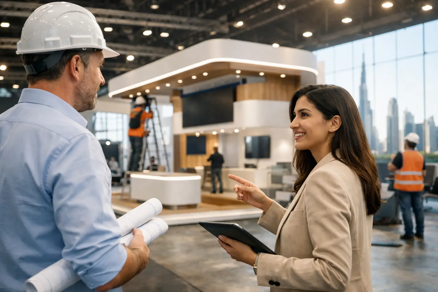
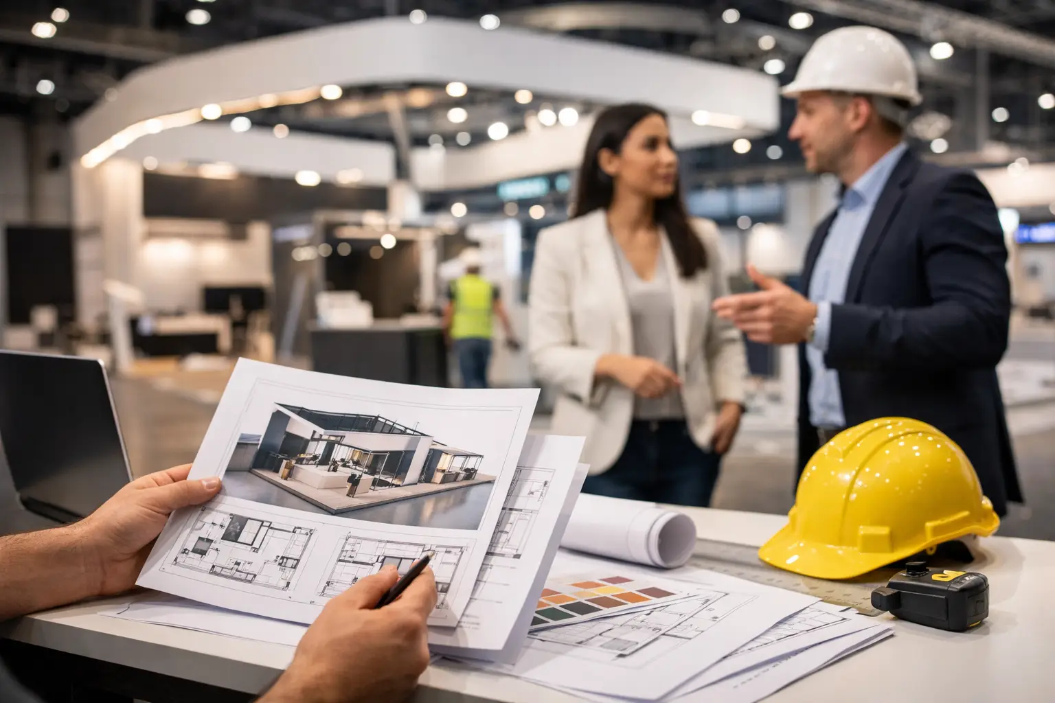
This is where experienced design-and-build coordination protects the concept. A layout has to look compelling, fit the venue, meet safety requirements, accommodate logistics, and be installed on time. LemonTree Exhibitions plans these factors together, from the first 3D concept through fabrication, installation, and dismantling, so the finished booth reflects the approved strategy rather than a compromised version of it.
Sustainability also belongs in the layout conversation. Modular elements, reusable structures, and material choices can reduce waste without making the stand feel generic. The best approach is to identify which elements should carry over to future shows and which are specific to a single campaign.
Give Every Layout a Clear Next Step
A booth layout succeeds when it helps the visitor take action. That action may be booking a technical consultation, requesting a quote, scanning a product code, scheduling a distributor meeting, or attending a live demonstration. Make the next step visible where the conversation naturally ends.
Before approving a plan, walk it as a visitor, a salesperson, and an installer. Can each person enter, understand, engage, and move without friction? If the answer is yes, the layout is doing more than filling a floor plan. It is giving your brand a dependable platform for better conversations and stronger exhibition returns.