

At a busy trade show, people decide in seconds whether your booth is worth a closer look. That is why strong exhibition stall decoration ideas are not about adding visual noise. They are about directing attention, shaping first impressions, and making your brand easier to understand from the aisle.
For marketing teams and exhibitors, the real challenge is balance. A stall has to look bold enough to stop traffic, clear enough to communicate quickly, and practical enough to support conversations, demos, and lead capture. The best concepts do all three.
What good exhibition stall decoration ideas actually do
Decoration should never be treated as surface styling. In a high-value B2B environment, every design choice needs a job. It should help visitors identify your category, understand your offer, and feel confident stepping into your space.
A well-decorated stall can create hierarchy in seconds. Visitors should be able to tell what your company does, where to look first, and where to stand without asking for directions. When decoration supports flow and messaging, the booth feels more professional and more credible.
This matters even more at large-scale shows where every competitor is trying to be seen. At events such as GITEX, ADIPEC, Gulfood, or trade fairs in Las Vegas and Chicago, visual competition is intense. Decoration has to work hard, but it also has to work smart.
12 exhibition stall decoration ideas that improve booth performance
1. Build around one strong visual message
Many booths fail because they try to say five things at once. A better approach is to anchor the space around one clear campaign line, product promise, or category statement. Your main wall, overhead signage, and welcome counter should reinforce the same message rather than compete with each other.
If your brand serves multiple verticals, resist the urge to showcase everything equally. Prioritize the most commercially relevant message for that event. Clarity usually outperforms completeness.
2. Use height to get noticed from a distance
One of the most reliable decoration strategies is vertical presence. Hanging signs, tall feature walls, and elevated branding help your booth stand out before visitors are close enough to read detailed graphics.
This is especially useful in crowded halls with long sightlines. Height creates visibility, but it needs to be handled with discipline. Too many stacked elements can make a booth feel heavy or cluttered. The goal is prominence, not bulk.
3. Treat lighting as part of the design, not an add-on
Lighting changes how materials, products, and brand colors are perceived. It can make a modest stand feel premium or make an expensive build look flat. Accent lights on hero products, even front lighting on graphics, and warmer lighting in meeting zones all help shape experience.
There is a trade-off here. Dramatic lighting can create impact, but if it is too dim or too theatrical, it may reduce readability and make business conversations uncomfortable. The best lighting plan supports both attraction and usability.
4. Create one photo-worthy focal point
Not every booth needs an oversized gimmick, but every booth benefits from a memorable focal feature. That could be a sculptural product display, a media wall, a textured brand installation, or a bold architectural frame.
The key is relevance. A focal point should connect to your product, technology, or brand story. When it feels random, it may attract cameras but not qualified leads.
5. Add texture and material contrast
Flat printed panels alone rarely create a premium impression. Material contrast gives a stand depth and refinement. Woodgrain laminates, backlit fabric, metal accents, acrylic details, greenery, and textured surfaces can all elevate a space when used selectively.
This does not mean every booth needs luxury finishes. It means the material palette should feel intentional. Even a cost-conscious stand can look polished if two or three materials are combined well.
6. Use color zoning to guide movement
Color is not only about brand consistency. It can also help organize the booth. A darker meeting area, a bright product display zone, and a clean neutral reception point can subtly guide visitors through the space.
This is particularly effective in medium and large stalls where multiple interactions happen at once. Without zoning, booths can feel visually busy and operationally confused. Decoration should help visitors know where to browse, where to watch, and where to sit.
7. Make product displays easier to scan
A common mistake is overcrowding shelves, pedestals, and walls with too many items. Visitors walking by cannot process that much information. Strong display decoration gives each product enough breathing room and uses labels, lighting, and grouping to simplify choice.
If you have a large catalog, show representative ranges instead of everything. A curated display often creates more interest than a complete one because it invites conversation.
8. Bring digital surfaces into the design
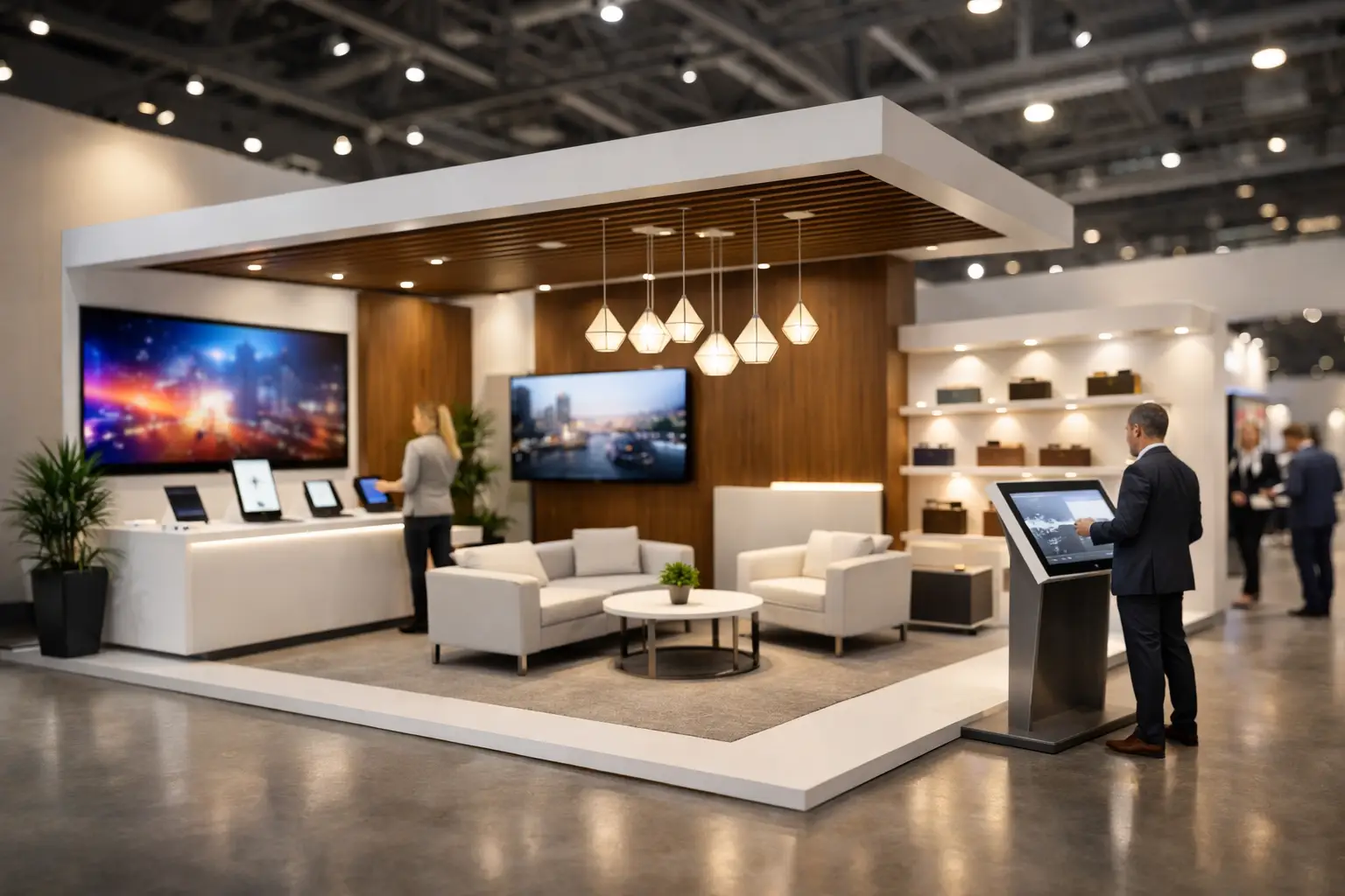
Screens are now standard, but they work best when they are integrated into the decoration plan rather than inserted at the last minute. LED walls, touchscreens, and looping product content can add movement and explain complex solutions quickly.
That said, bigger is not always better. If the content is generic or repetitive, a large screen becomes background noise. Digital elements should support your sales objective, whether that is product education, brand storytelling, or crowd building.
9. Use open frontage wherever possible
Decoration should never block entry. Heavy counters, oversized furniture, or decorative barriers at the front edge of the stall can reduce footfall. Open frontage makes the booth feel more welcoming and gives staff a better chance to start conversations naturally.
For some industries, privacy matters, especially in pharma, government, or high-value B2B discussions. In those cases, the answer is not closing the front. It is combining an open public zone with semi-private meeting areas deeper inside the booth.
10. Include branded hospitality with purpose
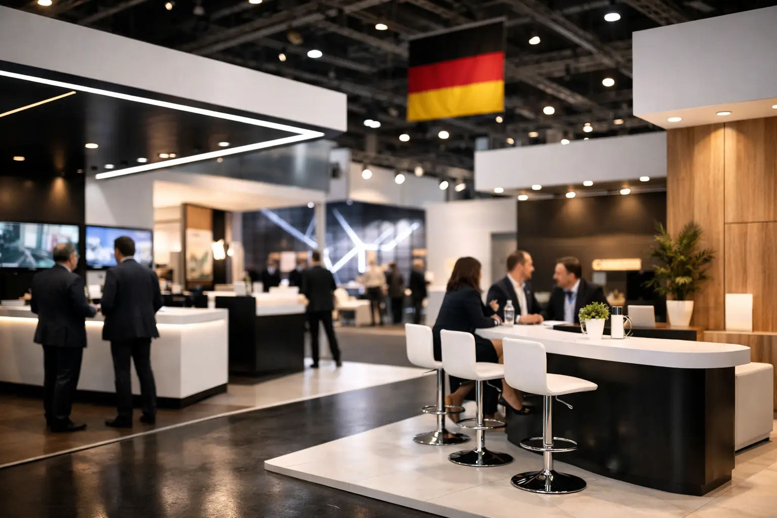
Coffee bars, refreshment counters, and lounge seating can be effective decorative features when they match the event strategy. They create dwell time and make meetings more comfortable. They also signal confidence and professionalism.
But hospitality only works if it supports the audience you want. At some exhibitions, a small premium refreshment point is enough. At others, giving too much space to hospitality can reduce room for products, demos, or messaging. It depends on whether your priority is relationship building, high-volume lead capture, or technical showcasing.
11. Add motion without creating distraction
Movement attracts attention. Rotating displays, animated content, kinetic lighting effects, or live demos can make a stall feel active and current. Motion is especially useful for technology, machinery, automotive, and product innovation brands.
The risk is overstimulation. If everything moves, flashes, or loops loudly, the booth becomes tiring. One controlled motion element usually performs better than several competing effects.
12. Design decoration around staff behavior
The strongest visual concept will underperform if the booth does not support the team using it. Decoration should consider where staff stand, how they greet visitors, where brochures or tablets are kept, and how meetings begin.
For example, if your reception desk is too large, staff may hide behind it. If demo stations are placed awkwardly, visitors may hesitate to engage. Good booth decoration is not only about what looks impressive in a rendering. It is about what makes interaction easier on the show floor.
How to choose the right decoration idea for your brand
Not every idea belongs in every booth. A startup launching one hero product may benefit from a simple, bold concept with one strong message wall and a clean demo zone. A multinational exhibitor with multiple business units may need layered communication, hospitality, and formal meeting rooms.
Budget also changes the right answer. Smart decoration is not the same as expensive decoration. A smaller stall with disciplined branding, quality lighting, and one distinctive feature can outperform a larger booth that lacks clarity.
It also depends on exhibition type. At consumer-facing events, immersive visuals and interaction may carry more weight. At industrial and technical shows, buyers usually respond better to clear product presentation, credibility cues, and efficient meeting space. The decoration should reflect how decisions are made in that sector.
Why execution matters as much as concept
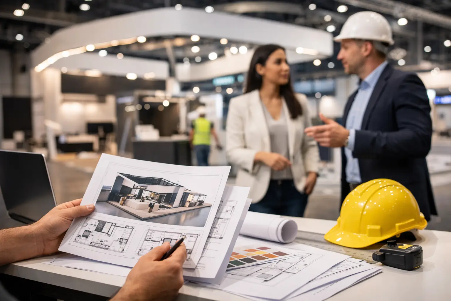
A decoration idea is only as strong as its build quality. Poor finishing, faded graphics, uneven lighting, and rushed installation can weaken brand perception immediately. Buyers notice details. So do procurement teams and international partners.
That is why experienced exhibitors look beyond design mood boards. They want to know who is fabricating the stand, how logistics are managed, how timelines are controlled, and whether on-site adjustments can be handled quickly. Creative ambition matters, but operational discipline is what protects it.
For brands exhibiting across multiple markets, consistency becomes even more important. A dependable stand partner helps ensure that decoration quality, visual standards, and functionality hold up whether the event is in Dubai, Mumbai, Riyadh, Chicago, or elsewhere. That combination of creativity and control is where decoration starts delivering real commercial value.
The best exhibition stall decoration ideas are the ones that make your brand easier to notice, easier to trust, and easier to engage with. If a visitor can understand who you are and why you matter before your team says a word, your booth is already doing serious work.