

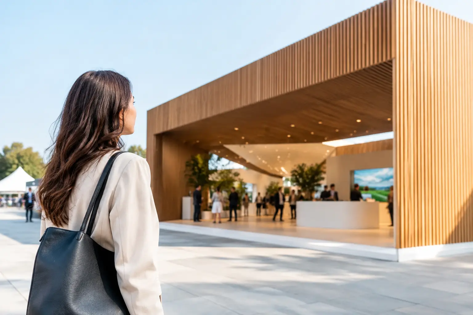

A pavilion has only a few seconds to explain itself across a busy exhibition hall. Visitors should immediately know who is represented, what connects the participating companies, and where to go next. That is why knowing how to plan pavilion branding is not simply a design exercise. It is a strategic decision that shapes visitor flow, exhibitor value, stakeholder confidence, and the perceived quality of the entire delegation.
Whether you are organizing a country pavilion, an industry association zone, or a multi-brand corporate presence, the challenge is the same: create one recognizable environment without making individual exhibitors feel invisible. The strongest pavilions achieve both. They set a bold collective identity, then give each participant a clear and credible place within it.
Start with the pavilion’s commercial purpose
Before approving colors, graphics, or a floor plan, establish what the pavilion must achieve. A government trade body may need to promote national manufacturing capability and help exporters secure international meetings. An industry group may want to position a sector as innovative and investment-ready. A large enterprise may use a pavilion format to unite several business units under one strategic story.
This purpose should lead every visible decision. If the goal is qualified buyer meetings, the pavilion needs easy-to-find meeting spaces, visible category signs, and a layout that supports conversations. If the goal is market awareness, an open frontage, a high-level message, and a strong visual landmark may matter more. If participating exhibitors are paying for space, fair visibility and practical lead-generation opportunities become essential.
Write a short pavilion promise before the design process begins. It should state who the group is, what it offers, and why a visitor should engage. For example, a national pavilion might center on advanced, export-ready manufacturing. A technology pavilion could focus on practical solutions for a specific industry challenge. This is not a campaign tagline yet. It is the decision filter for the project.
How to plan pavilion branding around one clear hierarchy
Pavilion branding works when visitors can read it in layers. From the main aisle, they should recognize the pavilion and its broad proposition. As they approach, they should understand the key sectors, capabilities, or featured experiences. At close range, they should be able to identify individual companies and find the right contact point.
The collective brand should own the biggest visual moments: overhead structures, feature walls, welcome points, digital displays, and major aisle-facing graphics. These elements carry the pavilion identity and make the group visible from a distance. Participating exhibitors then need a disciplined, repeatable brand zone that can include their logo, company name, category, and concise supporting message.
The common mistake is treating every participant as if it needs equal-scale branding on every surface. The result is visual competition, fragmented messaging, and a pavilion that feels like disconnected booths placed side by side. A better approach is to define a clear hierarchy: the pavilion identity leads, zones organize the experience, and exhibitor identities support discovery and conversation.
This does not mean suppressing individual brands. It means giving them visibility where it has the most value. A well-positioned fascia, digital directory listing, product display label, and meeting-room presence can be more effective than adding logos to every wall.
Create a system, not a one-off visual
A pavilion needs a branding system that remains consistent across physical and digital touchpoints. This includes the entry statement, signage rules, exhibitor identification, staff badges, directories, screens, brochures, hospitality areas, and social-ready photo moments.
Set practical rules early. Determine logo sizing, approved backgrounds, type styles, graphic placement, image treatment, and the maximum amount of text allowed in each area. These guidelines protect the overall environment when multiple exhibitors submit assets at different times and in different formats.
Consistency is especially valuable when the pavilion includes small and large companies. A structured system gives every participant a professional presence while preventing the loudest visual identity from dominating the shared space. It also makes late additions easier to manage without compromising the finished build.
Design the visitor journey before the graphics
Branding should help people move, not merely decorate surfaces. Begin by mapping the visitor journey from the most likely approaches to the pavilion. What do attendees see first? Where do they pause? How will they find a specific sector or exhibitor? Where can they have a private discussion without leaving the area?
An entry point should do more than display a logo. It should orient visitors quickly, using a direct message, a directory, a reception point, or a feature that explains the pavilion’s purpose. Large pavilions often benefit from a central welcome desk paired with visible wayfinding at key decision points. Smaller pavilions may rely on a single high-impact entry graphic and a concise layout.
Zone names should use language visitors understand immediately. Terms such as Energy Solutions, Smart Manufacturing, Food Innovation, or Export Services are clearer than internal program names. If several product categories are represented, use color, icons, or numbered zones sparingly to support navigation. Too many visual codes create hesitation rather than clarity.
Meeting spaces deserve attention here. A pavilion can attract significant traffic and still underperform if serious conversations take place in noisy aisles. Semi-private meeting rooms, hospitality lounges, and bookable tables improve the visitor experience and signal that the group is prepared to do business.
Balance spectacle with operational reality
A bold overhead sign, LED feature wall, or double-decker pavilion can create an immediate market presence. But branding decisions must work within venue rules, sightline restrictions, budget, rigging approvals, and construction timelines. The best concept is one that can be fabricated safely, installed precisely, and maintained throughout the show.
This is where early coordination between the brand team, pavilion organizer, and stand builder pays off. Share the event manual, floor plan, sponsorship requirements, exhibitor list, brand files, and target budget before design direction is finalized. These details influence everything from permitted heights and electrical loads to the location of storage and the viability of large-format graphics.
Digital content also needs realistic planning. LED walls can communicate a powerful pavilion story, but only if the content is readable from the intended viewing distance and does not distract from exhibitors. Short, high-contrast messages and purposeful motion usually perform better than long presentations or dense corporate videos. Consider who will update the screen content, schedule featured exhibitors, and troubleshoot files on site.
Sustainability is another practical consideration. Modular structures, reusable graphic frames, recyclable materials, and adaptable furniture can reduce waste without making the pavilion feel generic. The right choice depends on whether the pavilion will travel to several exhibitions, how often participant lists change, and the required level of customization.
Give exhibitors a clear participation framework
Pavilion branding becomes difficult when individual expectations are unclear. Participants need to know what is included in their package, which branding locations they receive, what assets they must provide, and when approvals are due. A concise exhibitor kit avoids last-minute conflicts and helps organizers protect the overall identity.
The kit should cover the required logo format, artwork deadlines, company profile word count, display specifications, staffing rules, and any upgrade options. It should also explain what cannot be changed. For instance, the pavilion fascia, shared color palette, circulation routes, and primary wayfinding should remain controlled by the organizer.
Fairness matters, but identical treatment is not always the right answer. A headline sponsor may receive a larger footprint or additional screen time. That can work well if the distinction is commercially agreed in advance and does not compromise the ability of other exhibitors to be found. Transparency prevents the pavilion from feeling like a collection of competing priorities.
Plan for measurement, not just opening day
A pavilion is a commercial environment, so define success before the event begins. Useful measures may include visitor scans, qualified buyer meetings, leads per exhibitor, product demonstrations, media interactions, social content captured, or post-show opportunities created. The priority depends on the pavilion’s mission.
Build measurement into the branded experience. A reception team can direct visitors and capture interest by sector. QR codes can work when they lead to a specific, useful action rather than a generic homepage. Digital directories can show which companies visitors search for most. Meeting booking tools can reveal whether the hospitality and private discussion areas are being used effectively.
After the show, assess more than footfall. High traffic means little if visitors could not identify the right exhibitors or if staff had no suitable space to convert interest into meetings. Gather feedback from exhibitors while the experience is fresh, then use it to refine the layout, messaging, and participation model for the next event.
A well-planned pavilion makes a large, diverse group feel intentional from the aisle to the final meeting. With clear hierarchy, disciplined visitor flow, and dependable execution, the pavilion becomes more than shared floor space. It becomes a confident platform for every participating brand to be seen, understood, and remembered.